Protection in Motion

PURE PPF
Protection in Motion
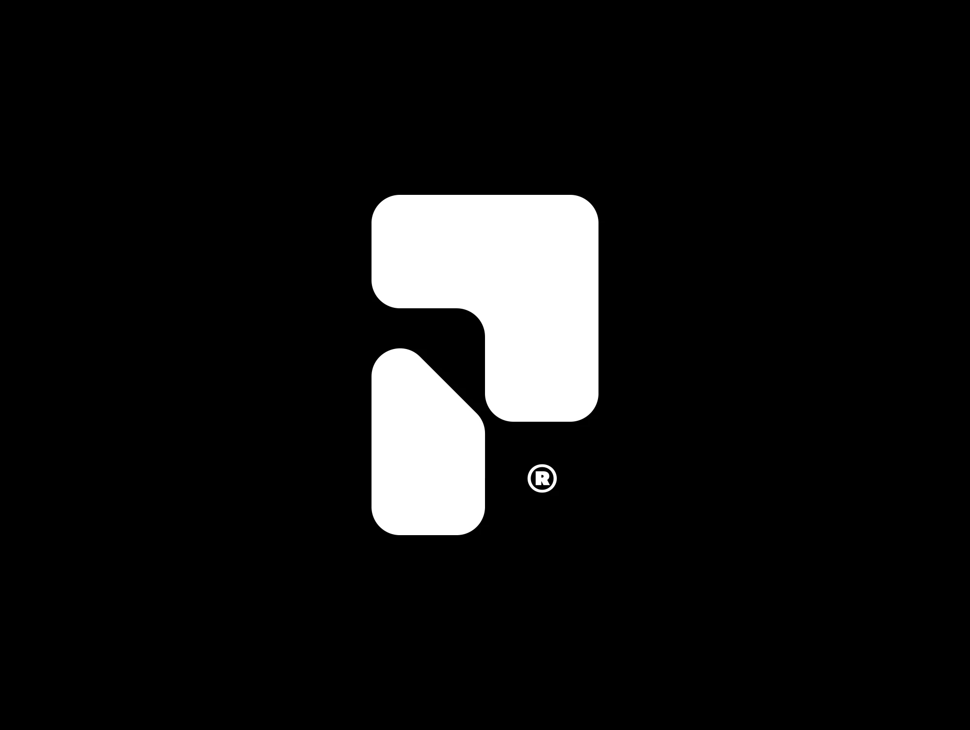
PURE PPF needed more than a logo; they needed a mark that symbolized protection and confidence, built with the same precision as the plotted kits they install. Our role was to create an identity that cuts clean, scales across touchpoints, and carries presence.
Brand Line
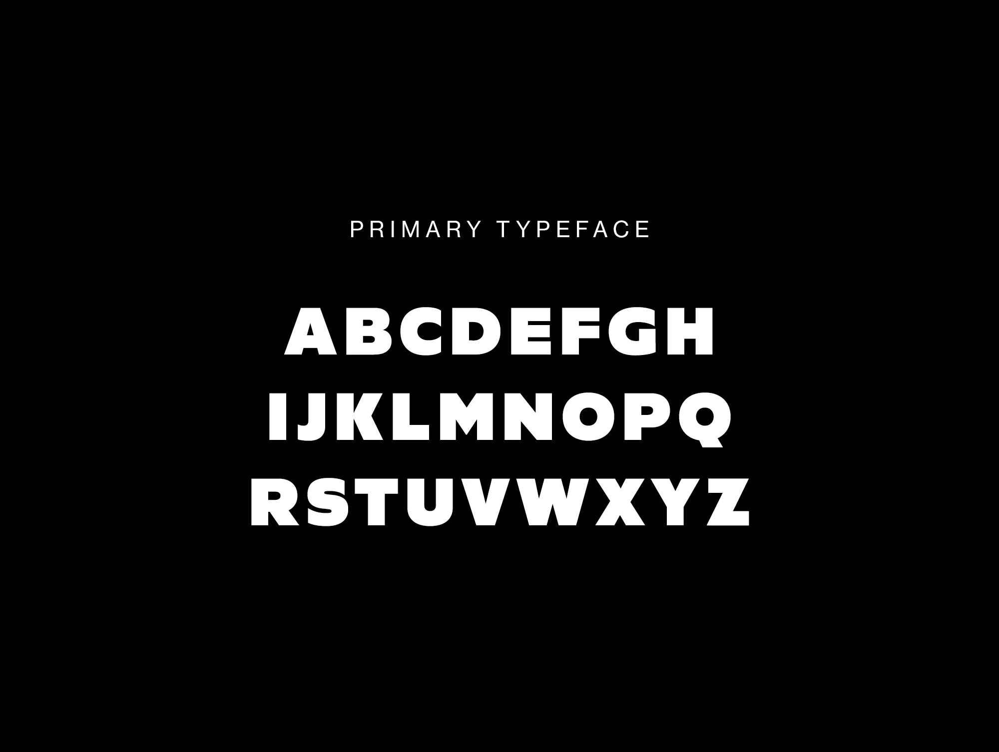
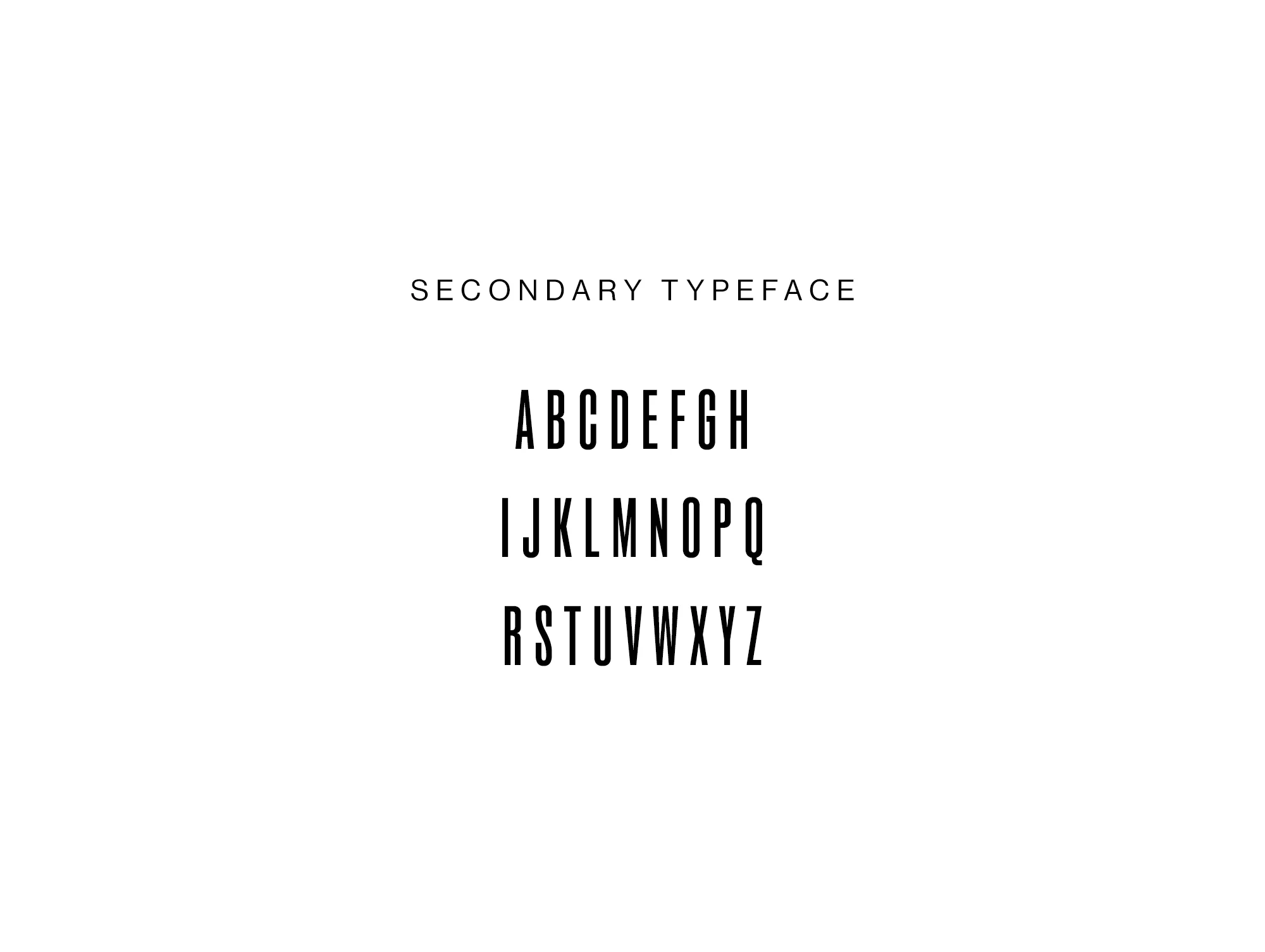
Strength, Clarity, and Confidence on Every Surface
Project Type
Branding
PURE PPF
Overview
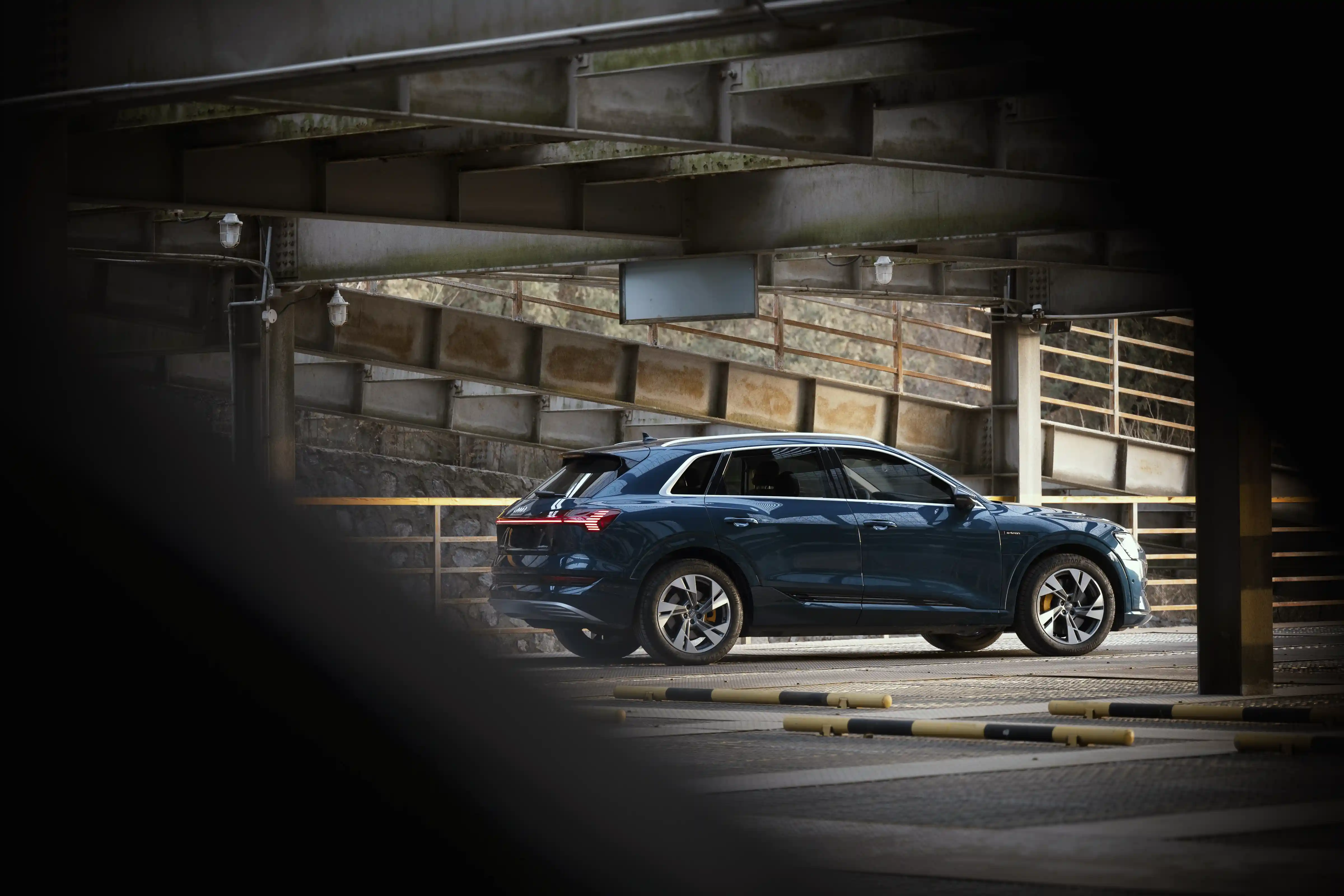
PURE PPF operates in the space between everyday drivers and high-end automotive clients. Their brand had to strike a balance between trust and accessibility, while maintaining the authority expected in the luxury segment.
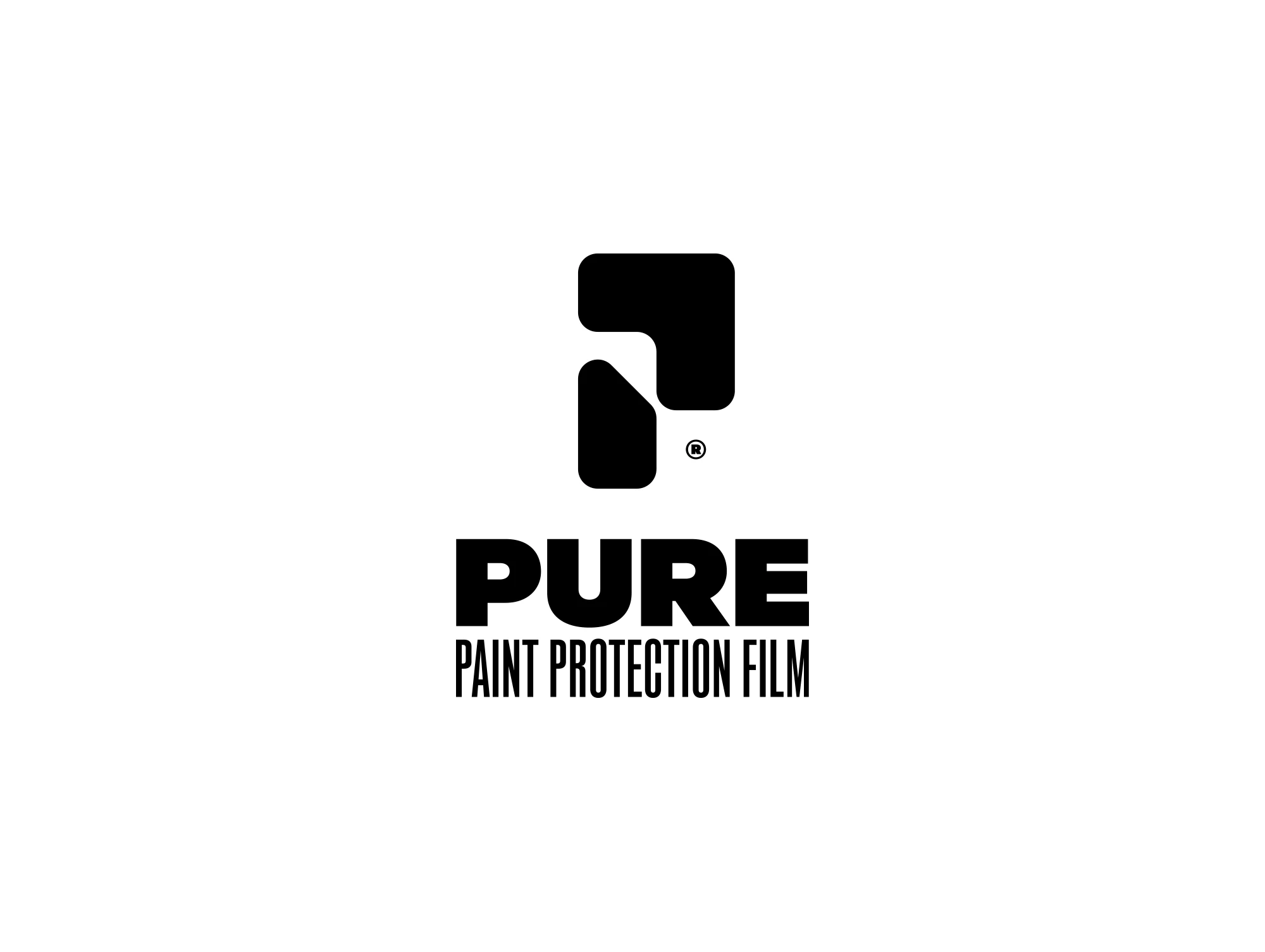
We created a brand identity that centers on a bold "P" mark, shaped as both an arrow and an umbrella. It speaks to protection, forward motion, and strength. Blue tones evoke calmness, stability, and repel elements, while the whole system instills confidence and trust.

PURE PPF
The Challenge
The challenge was to design a mark that went beyond aesthetics. It needed to function as a bold standalone icon, hold symbolic weight, and translate seamlessly across apparel, signage, and studio applications. Every angle had to embody clarity, protection, and forward drive.
PURE PPF
The Solution
We created a brand mark that fuses symbolism and precision, utilizing the shape of the letter "P" that doubles as an arrow and an umbrella, resulting in a singular, versatile identity that conveys strength, movement, and protection in a single glance.
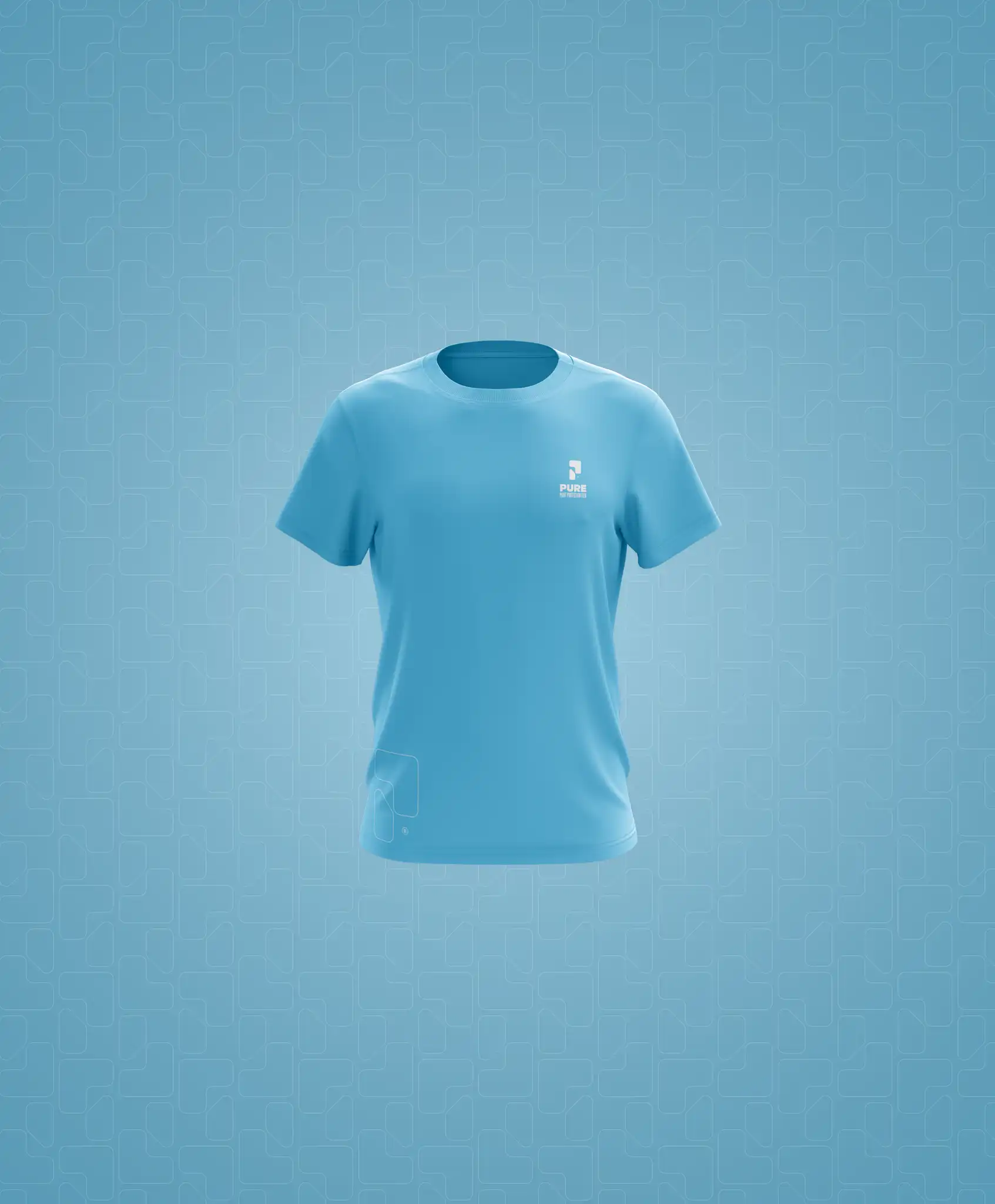
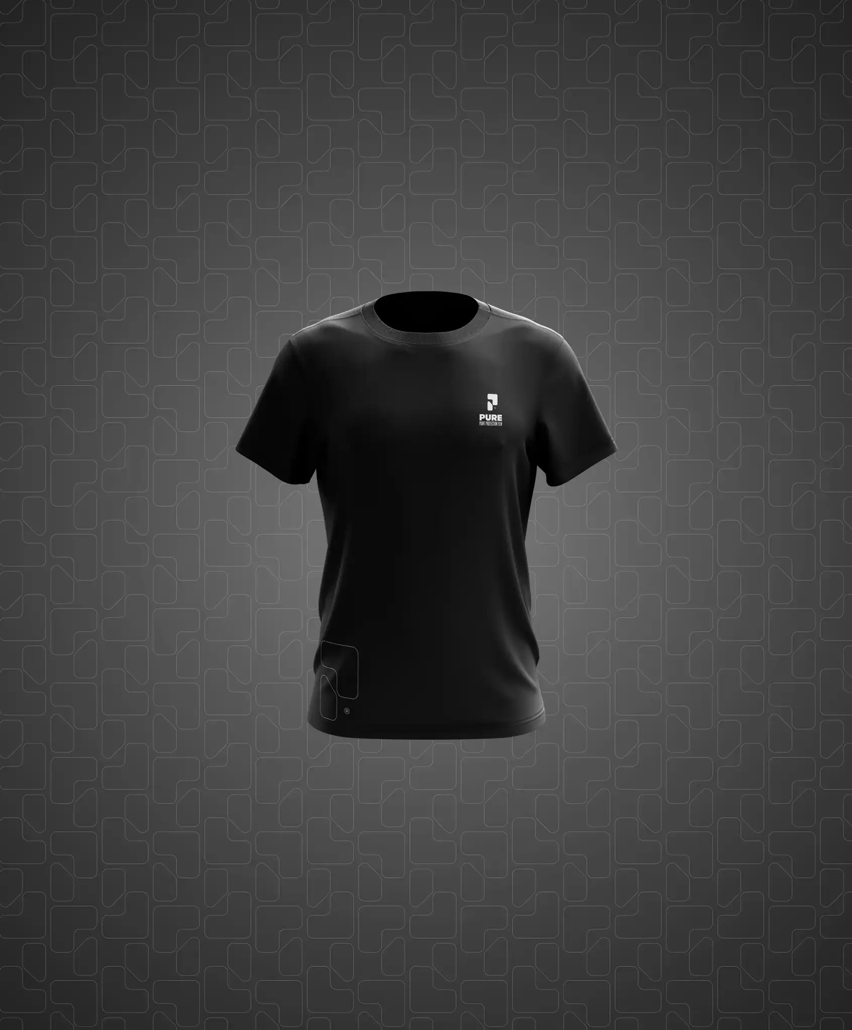
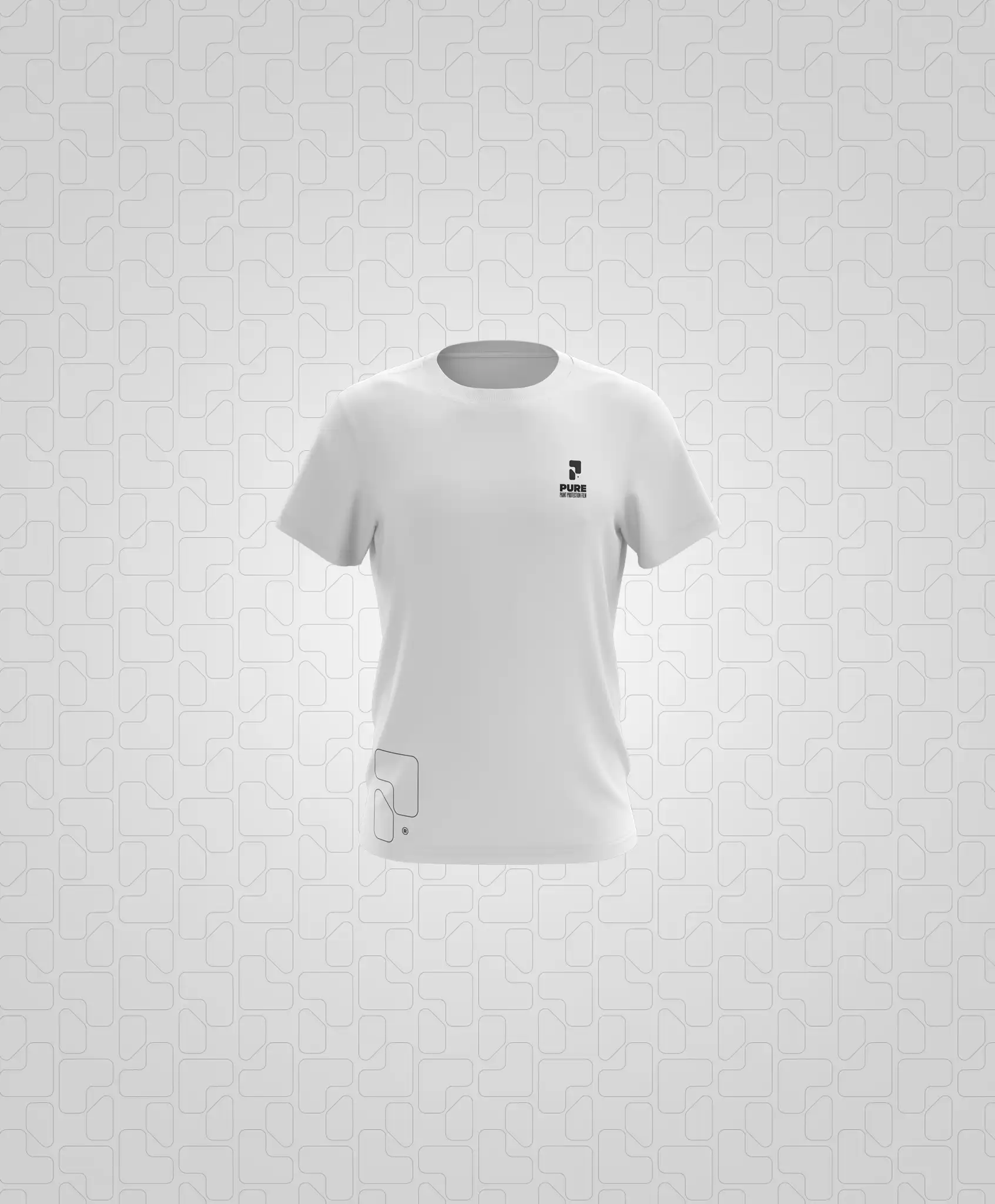
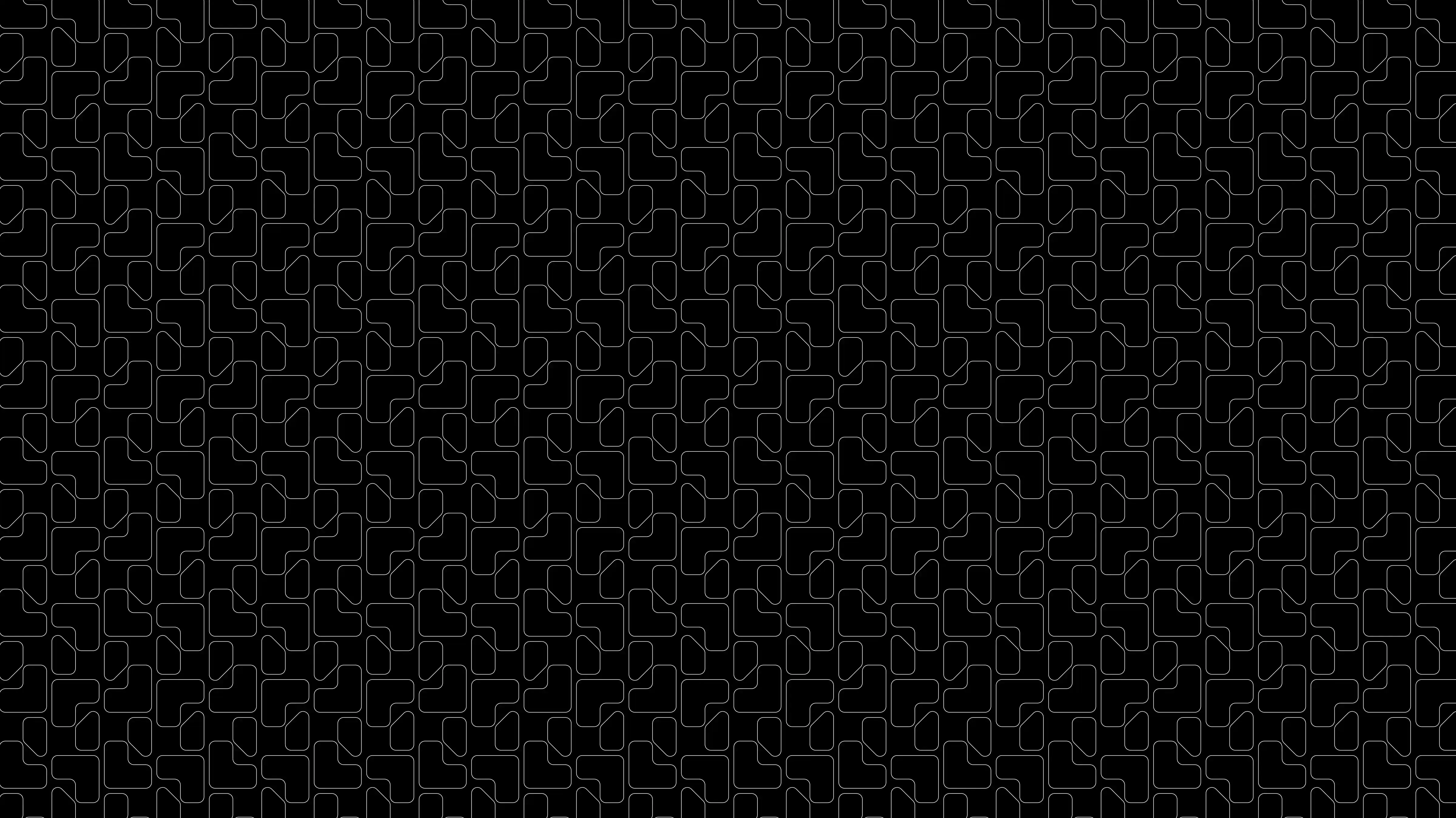
The identity was extended into apparel, collateral, and repeat patterns, making the brand visible and scalable across touchpoints. The result is a system that's modern, sharp, and unapologetically confident.