Performance Chalk for Athletes that Push Boundaries
SATTVA CLIMBING
Performance Chalk for Athletes that Push Boundaries
A premium climbing brand that challenged industry conformity, delivering stripped-back performance chalk and gear with raw attitude and local roots.
Brand Line
A Place for the Soul and Inspiration for the Journey
Project Type
Branding | Marketing | Product Design
SATTVA CLIMBING
Overview
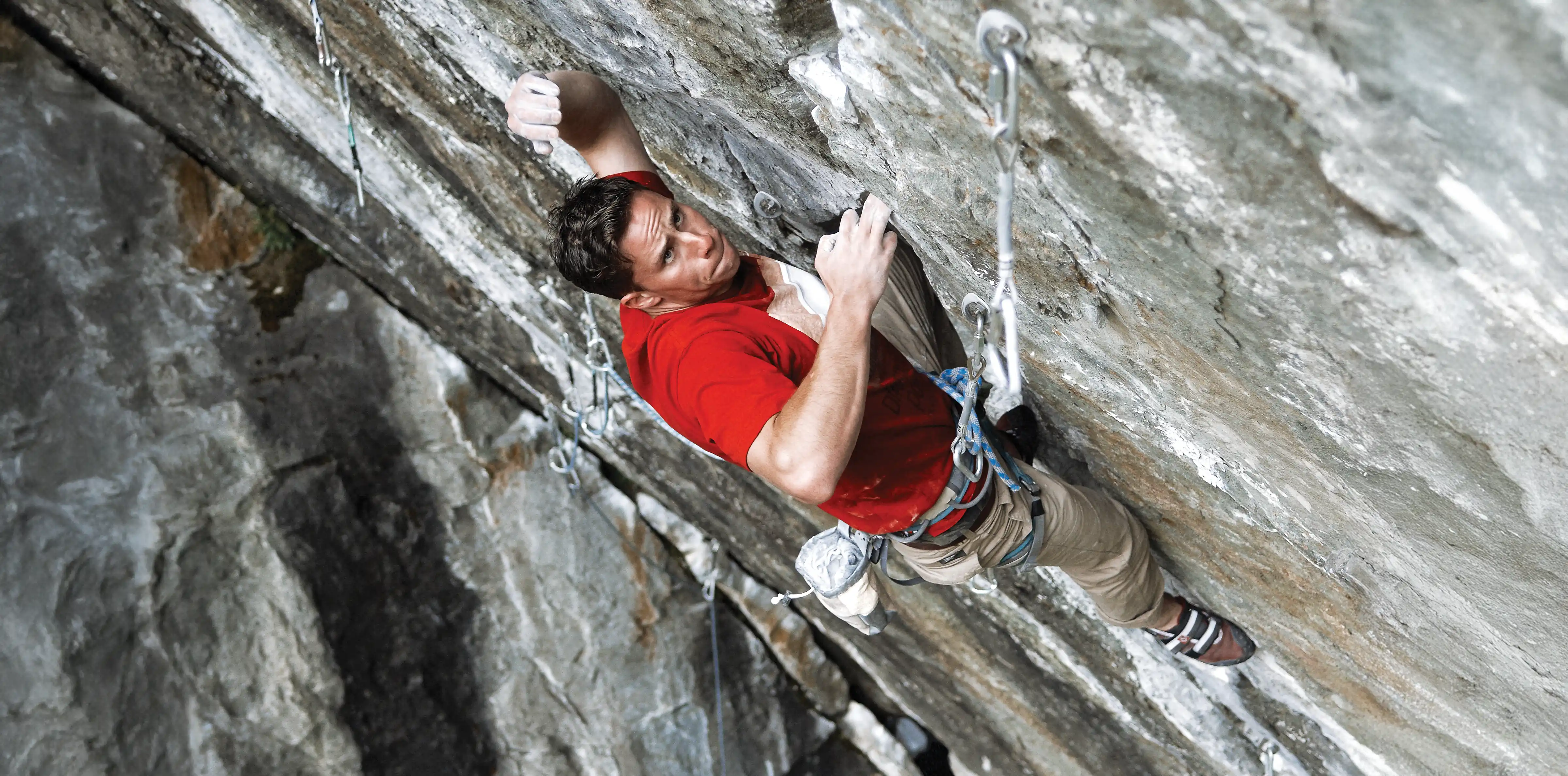
Sattva was forged at the intersection of chaos and clarity, countercultural grit fused with minimalist precision. The design system was raw yet controlled, functional yet emotional. Every surface, colour, and line was built to feel like climbing itself: intense, unpredictable, honest.
In an industry that markets escapism, Sattva spoke to the ones who never needed an escape, the lifers: the chalk-stained, sunburned, calloused-hand climbers who know the feeling of both failure and sends. The challenge was to build a brand that looked premium but breathed dirt and authenticity. The solution was a design that refused to perform for approval and instead earned respect through truth.


SATTVA CLIMBING
The Challenge
The climbing market is a parade of sterile "performance" brands with identical voices. Everyone says purity, but few actually live it. Chalk bags resemble soda cans, labels resemble corporate disclaimers, and authenticity is often an afterthought. Sattva needed to flip that narrative to design something that felt more human, more real, and unapologetically raw. A brand that lived in the same emotional space as chalk dust, flappers, and adrenaline.


SATTVA CLIMBING
The Solution
We built Sattva from the ground up, no templates, no borrowed tone, no fake elegance. The brand was carved from the same mindset that defines the climbers who use it: direct, humble, obsessed. Every detail was built with purpose, from the stripped-back typography to the packaging hierarchy that prioritized clarity over clutter. We designed an identity system that wasn't afraid of silence, negative space became attitude, and minimalism became rebellion.


The texture of the brand sits somewhere between chalk dust and calm. Every colour and type choice serves the story; black for control, red for life, and white for clarity. We ditched the over-explained, hyper-technical voice of competitors for something real, conversational, and brutally honest. Sattva wasn't just selling grip; it was selling intent. The message was simple: less perfection, more truth.