Industry Leaders, Enough Said
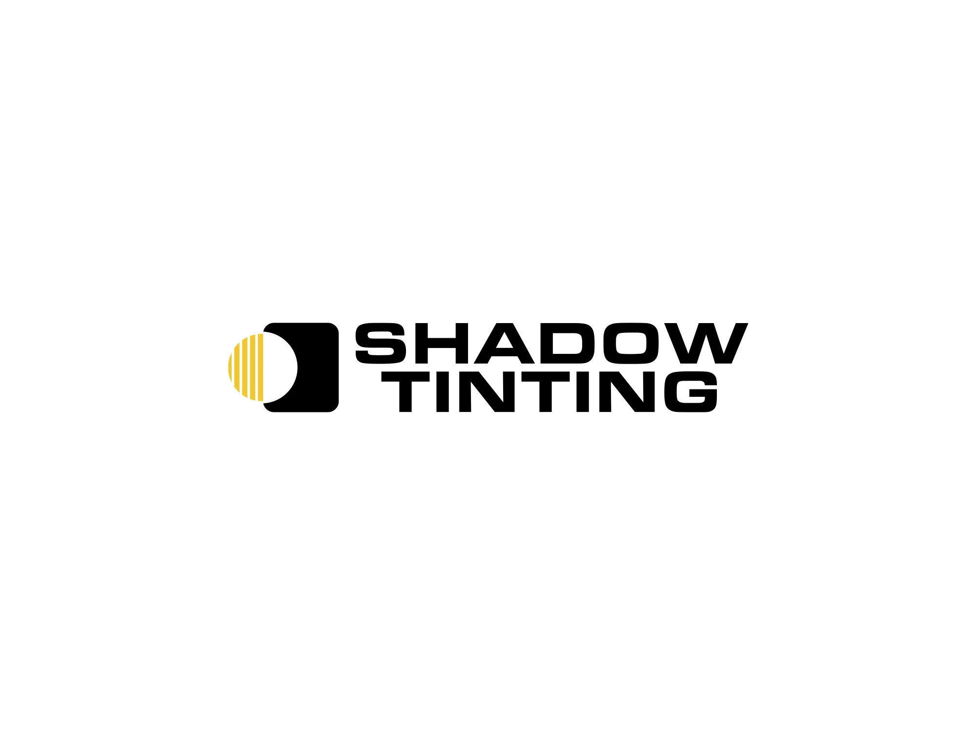
SHADOW TINTING
Industry Leaders, Enough Said
Shadow Tinting needed more than a reworked logo; they needed an identity stripped to the core, rebuilt with intent, and sharpened into presence. A studio at the intersection of protection and performance demanded a system as bold, clean, and lasting as their work in the shop.
Brand Line
Built in Shadow. Made to Dominate
Project Type
Branding | Website
SHADOW TINTING
Overview
A rebrand isn't a facelift, it's a reset. Design goes beyond overstatement; it embodies control, power, and presence. For Shadow Tinting, the identity had to be modern, sharp, and unapologetic, capable of owning space both in print and online. This wasn’t about chasing trends, but building a system that projected permanence and dominance.
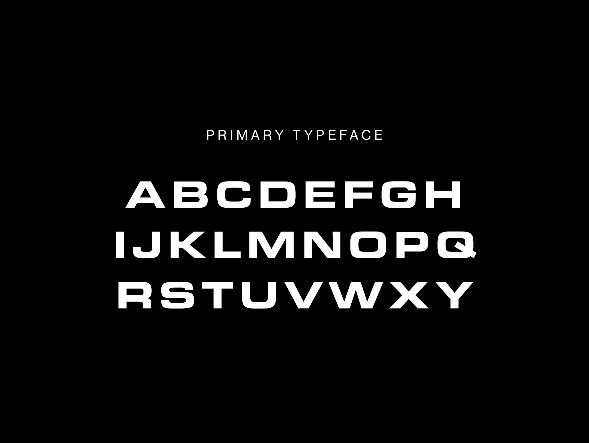
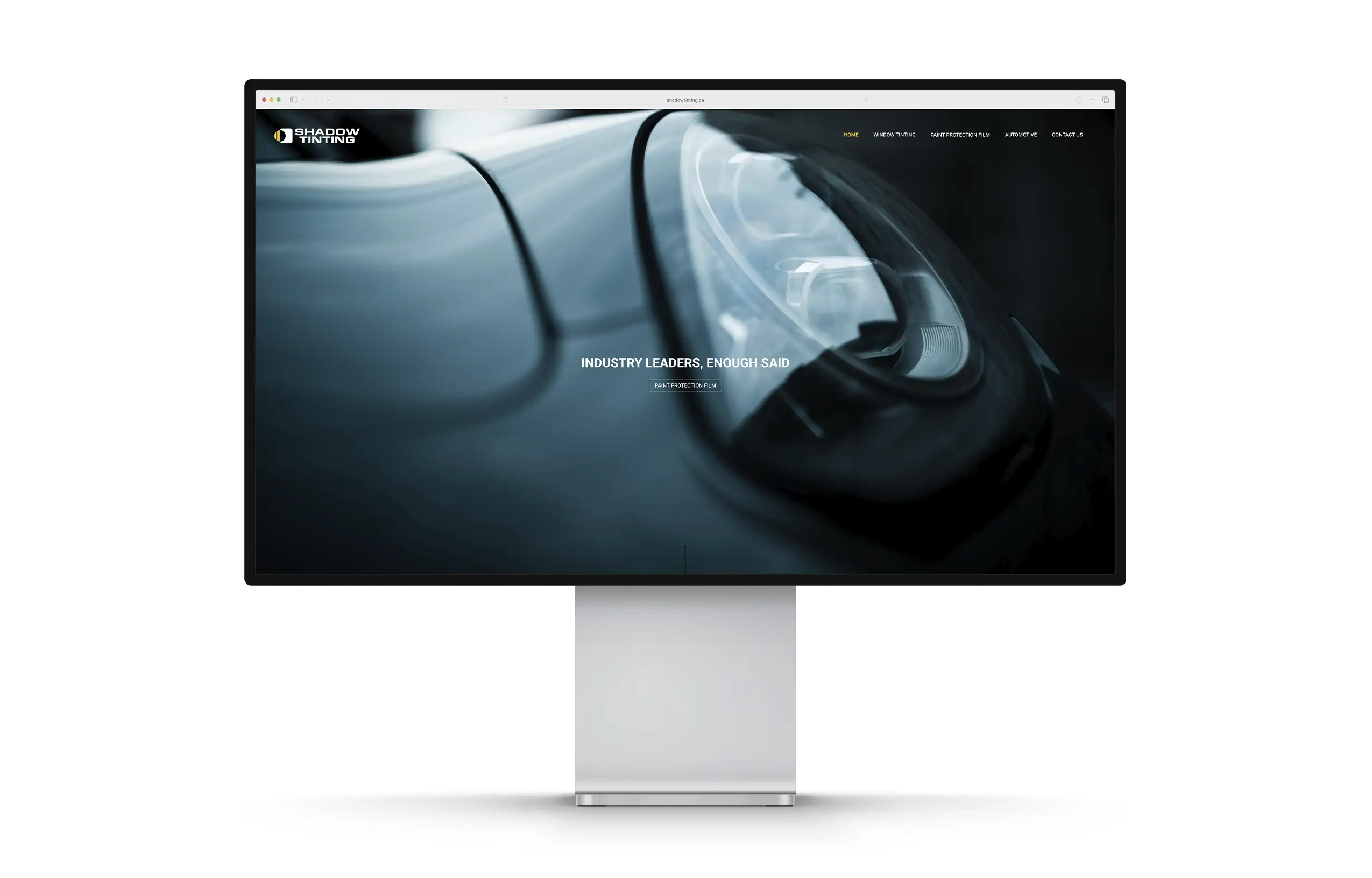
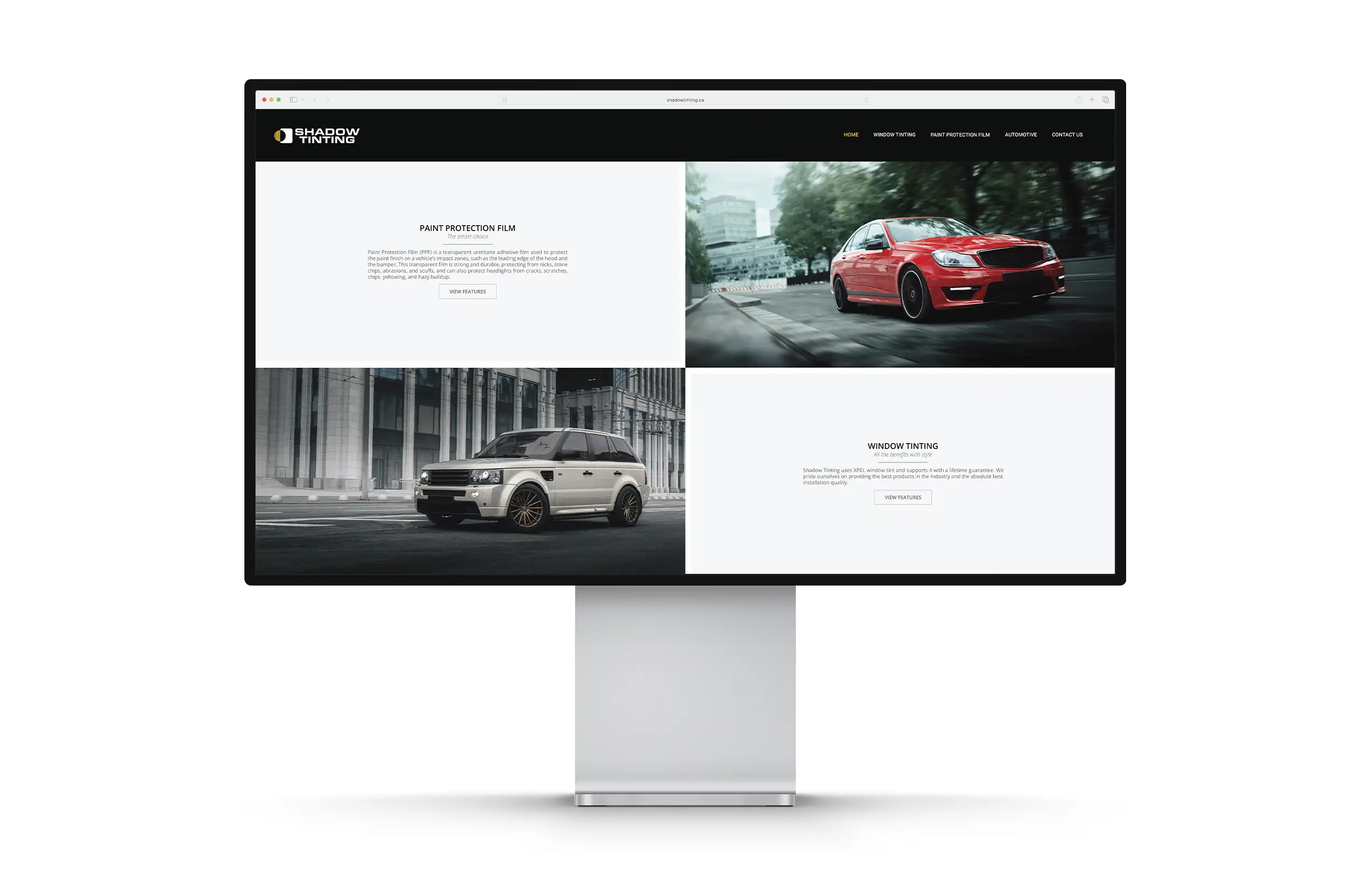
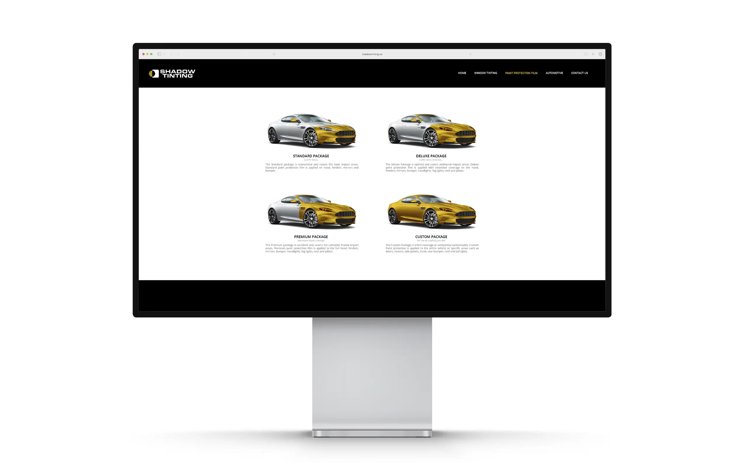
This rebrand focused on raw clarity and unapologetic boldness. Typography with authority, colour with impact, and systems built for adaptability. Black and yellow became more than contrast; they became tension and dominance. That same ethos extended into the website: structured with precision, stripped of distractions, and built to deliver clarity with impact. From typography to flow, the site doesn’t scroll quietly. It moves with intent, just like the vehicles it protects.


SHADOW TINTING
The Challenge
The challenge was to shed what felt outdated without losing the raw edge of the brand. Shadow Tinting already had a reputation built on precision and results, but their identity didn't match that energy. The work required a system that could scale across apparel, the studio, vehicles, and digital platforms. The website wasn't just a page; it had to be a platform, designed to reflect the raw identity we built while delivering a user experience that felt sharp, clean, and high-performance. Luxury had to meet grit in one seamless system.
SHADOW TINTING
The Solution
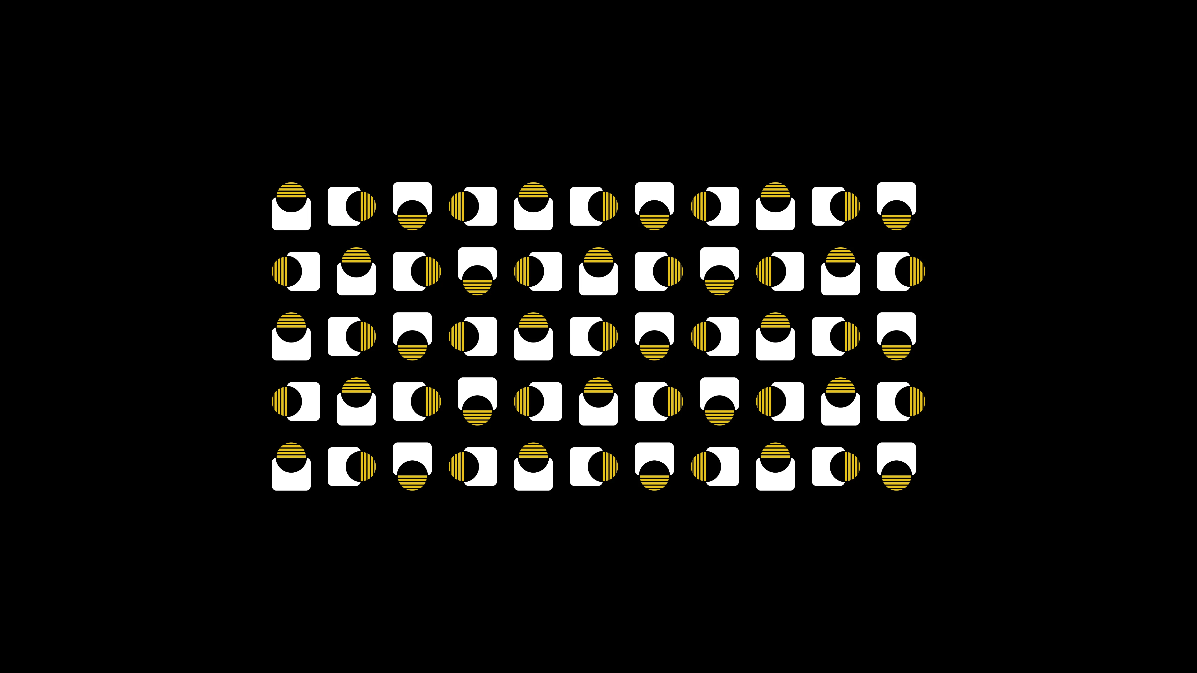
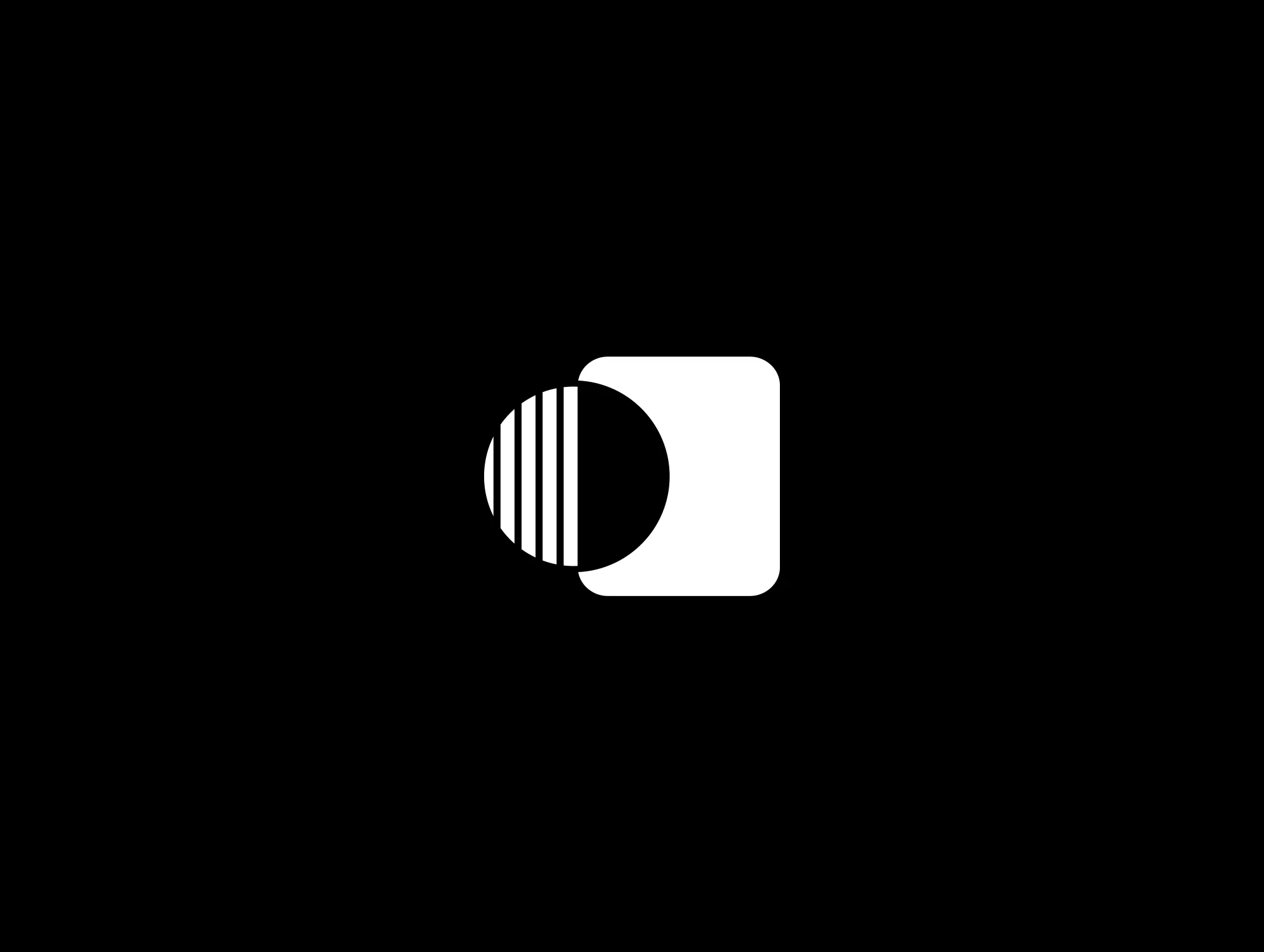
We built a brand that doesn't follow. Bold geometry, strong type, and a visual system designed to dominate every surface it touches. The brand mark carries weight, the typography commands presence, and the website extends that authority into digital. Sharp layouts, bold hierarchy, and design decisions echo protection and performance, online and offline.
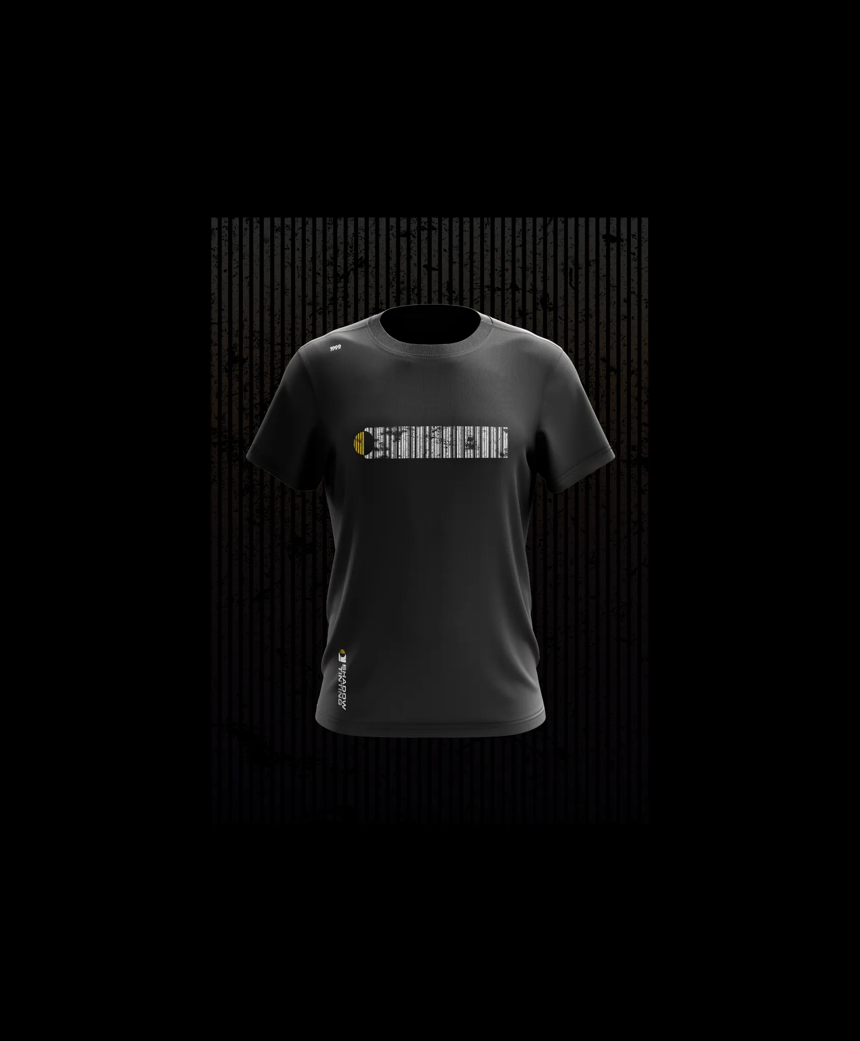
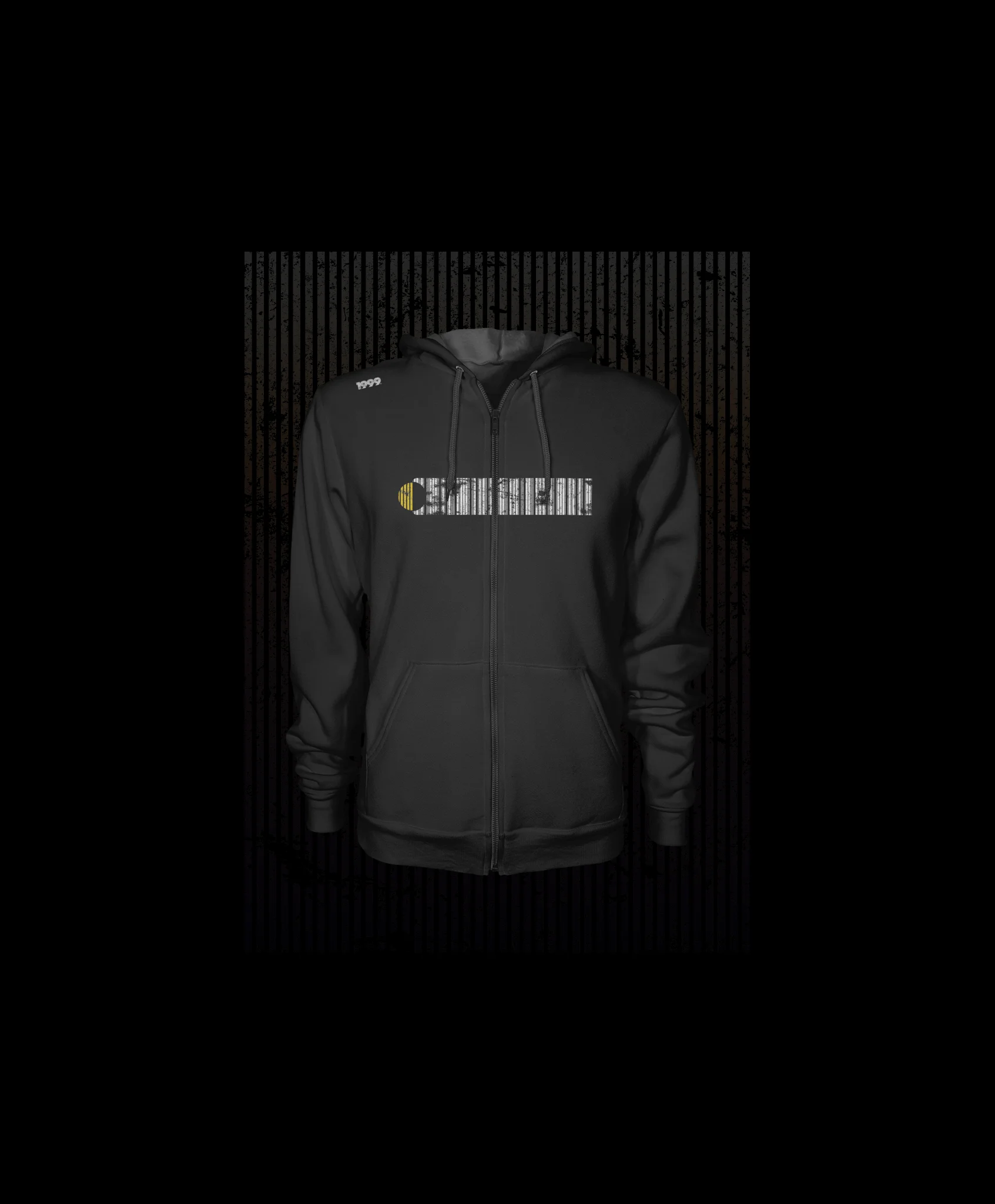
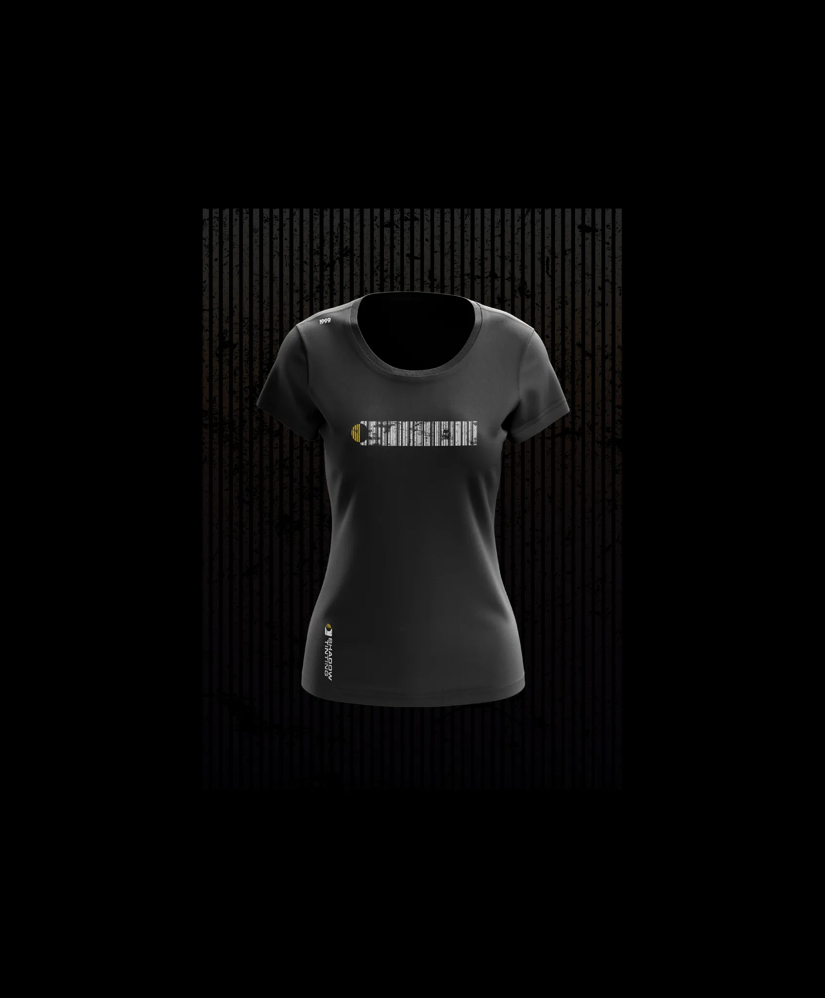

The rollout carried the identity into apparel, collateral, and digital platforms. Step-and-repeat patterns, grungy tees, bold hoodies, every piece reinforced the same message: Shadow Tinting isn't here to blend in. They lead. They dominate. Their identity scales across every medium with purpose, impossible to ignore.